shaping the logo
How you want to organize your repaints is really up to you and with some experience, you will find the way that you are most comfortable with. Personally, to make sure that I don’t forget some details along the way, I usually start from the nose and cockpit section and go down the fuselage to the tail section. But you might want to do it differently, for instance starting with the larger livery elements (titles, logos, cheatlines) down to the finer details.
In this case, since we started with the tail background, we will pick it up from there and complete the tail section, then go forward and end with the nose section.
The tail logo is relatively easy to do. As we can see from the pictures, it consists of a white ellipse with a circle, probably figuring a planet and its orbit trajectory or something similar. We will use the same technique as before to draw it, first selecting a full side picture, copying and pasting the tail section into the pk. We could use the original picture we already used, but since we have found another one with a close up on the tail, we will use that one as it gives more detail. To resize the picture to fit the paintkit, we will use the tail rudder horizontal lines as a guideline, making sure that other tail elements such as the horizontal stabilizer bare metal rail also fit. Again, don’t expect the whole thing to fit 100%, but get as close as possible, and then we will fix the finer details at a later stage.
Using the same technique as described above when we made the green background shape, we will path this logo before applying it to the tail. We will see that when creating a path, we can make a single shape as we did before, or add as many different shapes as we want in one single path, yet retaining the ability to manipulate and use each of these shapes separately.
First, we will path the elliptical shape using the pen tool as before.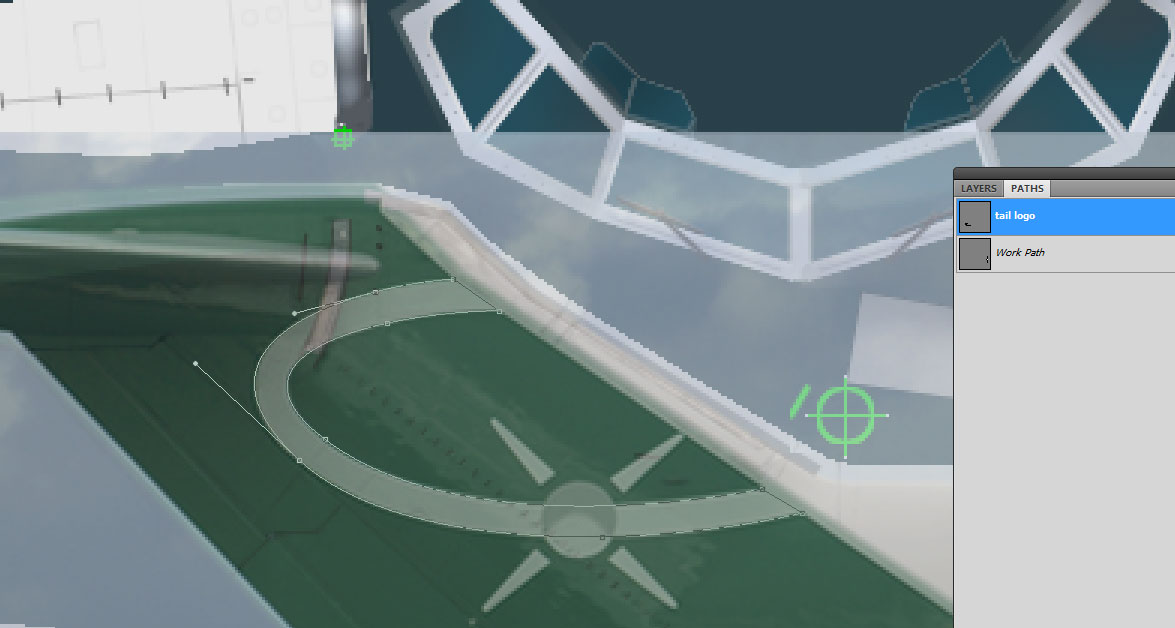
Now we will add the star, or whatever it is. Since it is a perfect circle, we can use the ellipse tool that will automatically help us draw a circle instead of manually pathing it. Check the rectangle tool in your tool box and select the third option in there, the ellipse tool. With your initial shape still active, and the ellipse tool selected, click anywhere on the psd and drag your mouse while pressing the shift key (this will produce a circle shape, dragging the mouse without pressing the shift key will give you an ellipse shape but not a perfect circle). Never mind the size and position of your circle, once you have finished drawing it, we will resize it and move it to the right location. Select the path selection tool (black arrow below the pen tool) and click on your circle. You should now see it with its anchor points showing as black dots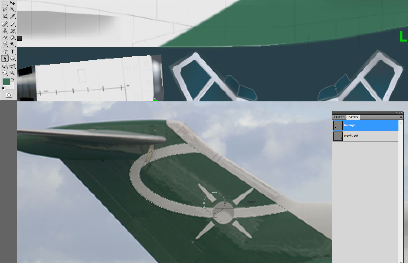
From the upper main menu, go to edit/transform path/scale (if a layer was selected in the workspace, the menu option would read “transform” and not “transform path”). A square has now appeared around your circle, and we will be able to move the whole thing around the pk, position it to its right location and scale it up or down to bring it to the right size we want. Of course, we can do this with any separate element of our path if we first select it as we just did for the circle. If only the path is selected instead of one of its elements, then of course, we will be able to move and scale the whole path.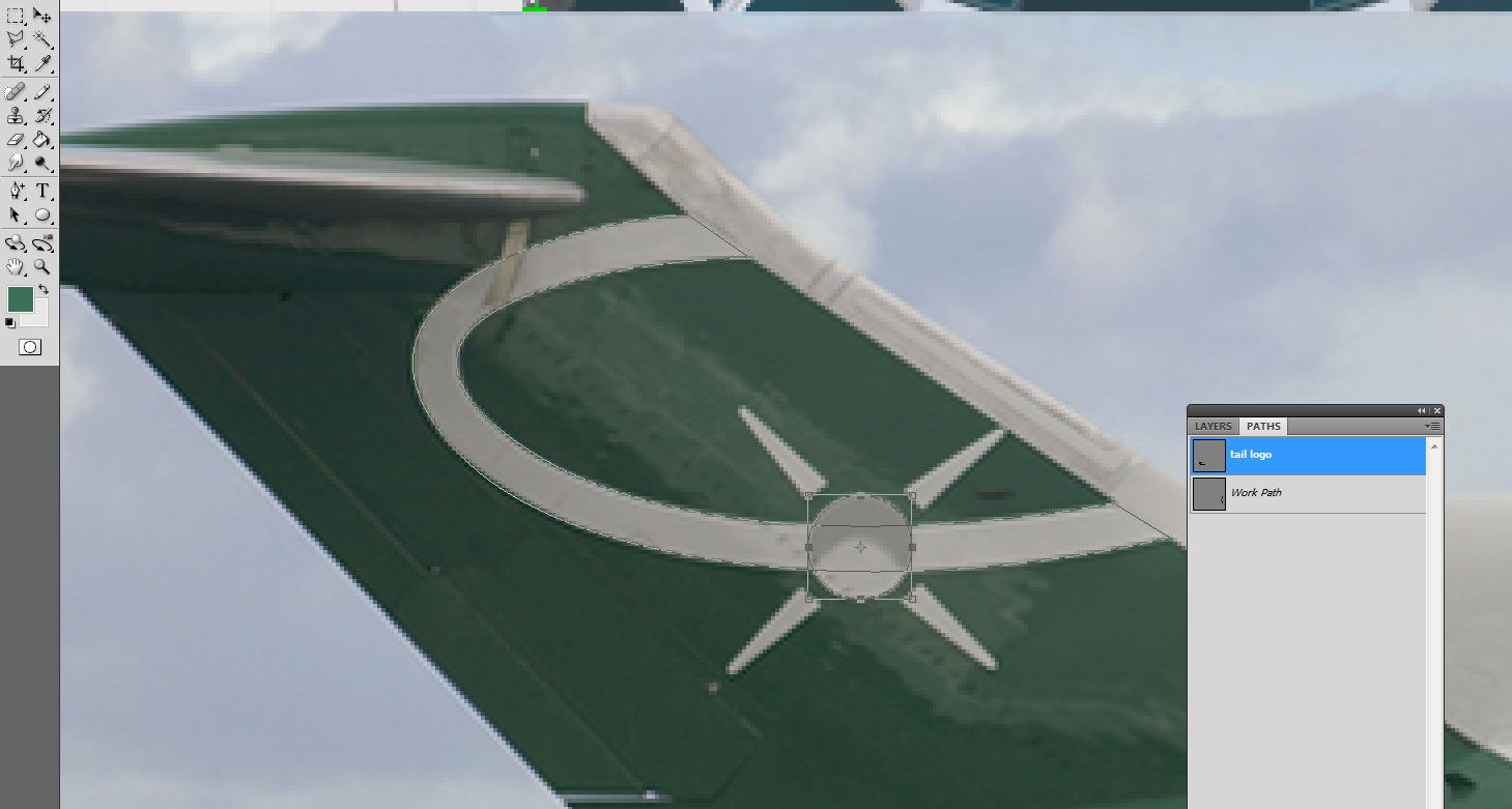
Now to the beams radiating from the star. We have four identical shapes, pointing in opposite directions, so instead of reinventing the wheel, we will first path one of these, and then duplicate that shape and move it accordingly. In this example, the shape is very simple and could be easily pathed manually all four times, but if and when you happen to deal with more complex shapes or designs, you will find this little trick to be very helpful and time saving!
So first, we normally path our first beam, and when done, we will select it by clicking on it with the path selection tool. Then from the upper main menu, we check edit/copy, and then edit/paste. Still using the path selection tool, we drag our beam and notice that we do have two separate beam shapes now. (it might not look obvious at first sight because when you copy/paste, both shapes are exactly on top of each other, so you still see only one shape, but if you drag it away you will see that the original shape is still there, and you now have a copy as well.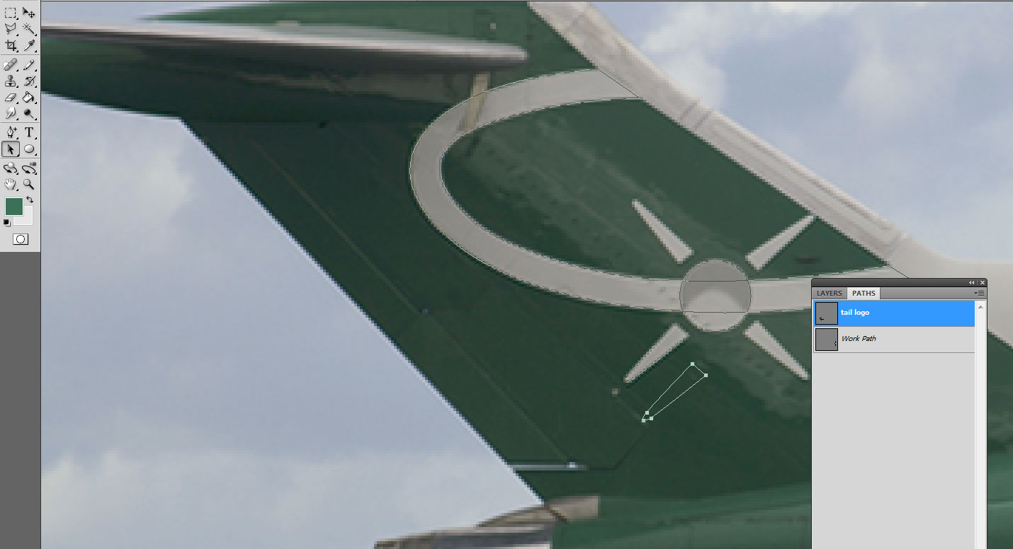
Since these beams are pointing in opposite directions, we will simply move this copy by checking edit/transform path/rotate 180°, and we should have now our beam #2 pointing in the right direction. All we have to do now is moving it to the right location. You will notice that it does not match perfectly the picture, but this is normal since the beam on the picture appears a bit bent as it follows the tail curvature, but our pk being flat, it will eventually get to the same result once mapped to the aircraft model. And we can always go back and fix the shape at a later stage if it doesn’t look right in the sim.
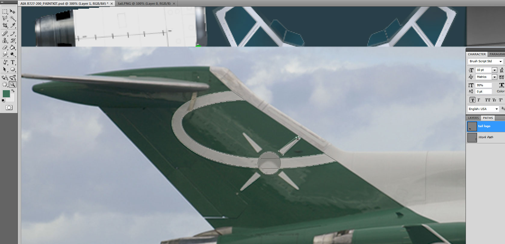
So now we have pathed all the logo elements, and we can deactivate the picture to adjust the logo on the tail itself. To do that, simply click the small eye symbol next to the layer containing the picture and it will become completely invisible. Of course, you can also delete the layer if you think you will not need it any more, but for now let’s keep it there just in case we need to go back to that tail logo later. As you can see, the logo is not perfectly positioned on the tail, but close to. So we will tweak it a little and use the various tail elements (lines, seams, antennas, curves and so on) as guidelines to make sure we have everything in the right position.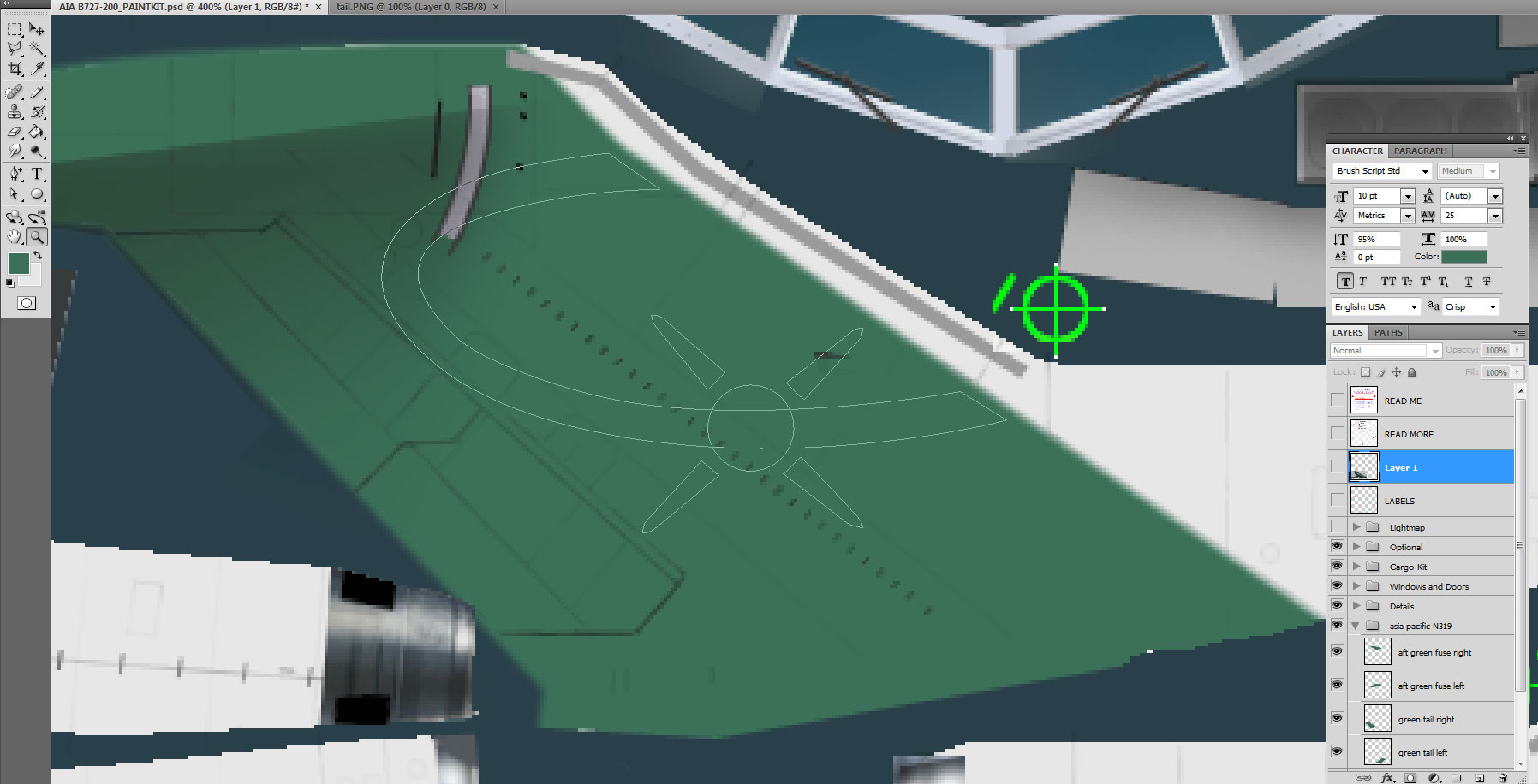
As a precaution, we will first make a copy of our path, so that if we are not happy with our tweaking, we can always come back to our original shapes. Right click on your path in the path palette, and select duplicate path.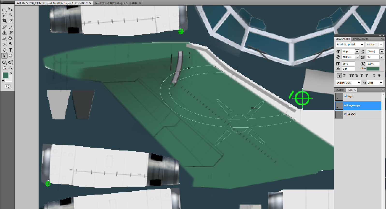
Here is the final result. I moved both tips of the ellipse forward so that they reach the edge of the green section, and checking the way the circle intersects the diagonal row of tiny airflow adjustment blades (can’t remember their exact name right now), I moved it ever so slightly (by a couple of pixels) to the front, and moved the front beam forward accordingly so that the distance between each beam and the circle remains equal, and we can notice that now, the front beam tip reaches the forward edge of the green section, as it should. So everything is fine, well almost. The pitot antenna intersects the front beam, while the picture shows it to be lower on the tail, between the front beam and the lower part of the ellipse. Such discrepancy will usually mean that you got something wrong, but in this case, all our other elements being in the exact right position, we can only assume that the pk is wrong. Or maybe this very aircraft has a non-standard antenna. So we will correct this detail, but first let us get done with the logo. It is white in the same colour as the rest of the fuselage. One thing about colours. Each colour is identified by its RGB or CMYK values. We are using here the RGB values, with all possible combinations between 0 and 255, an RGB value of 0,0,0 being pure black and 255,255,255 being pure white. For some reason, these pure colours will not look good in the sim, and you will notice that the background white in most pk’s is in fact a very light grey with a value of 231,231,231 or something close to it. In this case, this is the background value so we will use this for our logo.
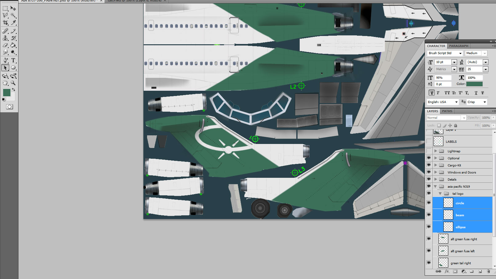
We were working with paths, but now let’s go back to layers. Let’s select the layer palette, and click on the last layer we created earlier, inside our “asia pacific n319” group. Of course, we don’t want to add anything to that layer, but use a new separate one for the logo. But selecting the last used layer first, then creating a new one will automatically create the new one right on top of the other, which is what we want. Remember that managing your layers in a coherent and logical way will save you a lot of time and frustration, as you will see that we will soon end up with lots of them!
To paint the logo white, we will use the exact same technique that we earlier used to make the green section. When dealing with complex shapes, I usually prefer to break them into simpler shapes and spread them over separate layers. This will give you crisper and sharper results when you later apply a filter on them; so here we will first create a new layer, then go back to the path palette, activate our logo path, and select the ellipse shape with the path selection tool. Right click on the path and select fill subpath. If you have already sampled the white colour with your eyedropper, as evidenced in one of the small colour cubes in your tool menu, you will select it directly as either the foreground or background –as is the case in my screenshot below. Otherwise, you can click the ‘colour’ option and manually enter the values for the colour you want to use to fill that shape, 231,231,231 being the values we need right now. Once this is done, make sure that the feathering option is ticked with 1 pixel width and anti-alias box is also ticked. Once completed, don’t forget to go back to the layer palette, select the new ellipse layer and sharpen the shape from the menu filter/sharpen/sharpen, and then filter/sharpen/smart sharpen with 1 pixel value matching your initial feathering value. We will then proceed with the other pieces of the logo, one layer for the beams, and one layer for the circle. As you can see in the screenshot below, I created one layer for each part and grouped all three layers in a sub-group named tail logo.